

The Ask: Create a capstone project on literally whatever.
The Insight: I don't really combine my professional work & my personal life together
The Idea: Make cool shit that is personal.
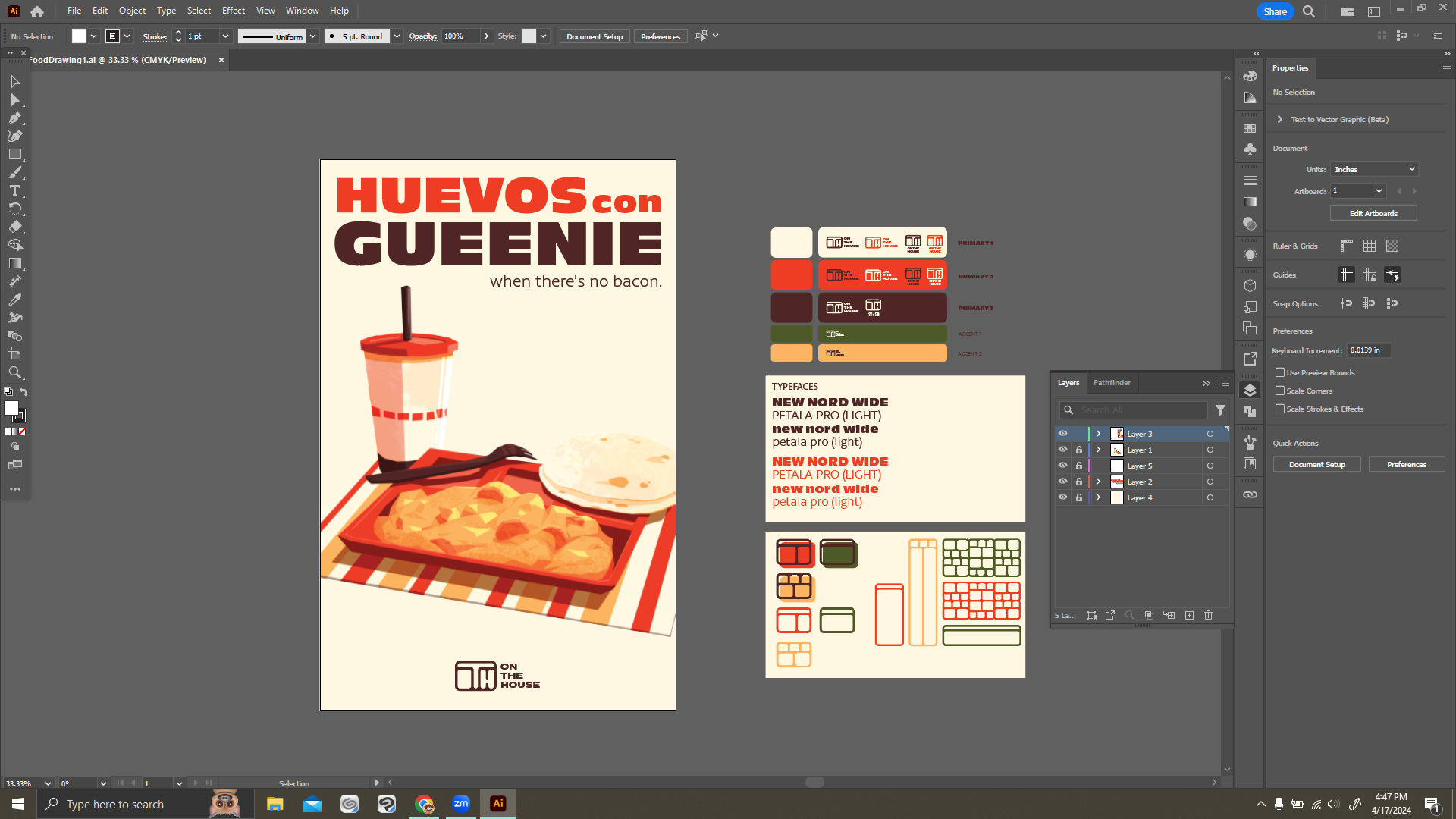
I grew up poor and relied on scrappy homemade meals and free school lunches. Fast food was always a rare treat, and the visual identities of brands were always so enticing, especially to children with limited options. As someone in working in advertising. the irony isn’t lost on me. How could I make a small, but personal commentary on that? My branding project uses fast food conventions for my own brand, On the House, to tell my story of the food that always there for me.
The Insight: I don't really combine my professional work & my personal life together
The Idea: Make cool shit that is personal.
I grew up poor and relied on scrappy homemade meals and free school lunches. Fast food was always a rare treat, and the visual identities of brands were always so enticing, especially to children with limited options. As someone in working in advertising. the irony isn’t lost on me. How could I make a small, but personal commentary on that? My branding project uses fast food conventions for my own brand, On the House, to tell my story of the food that always there for me.
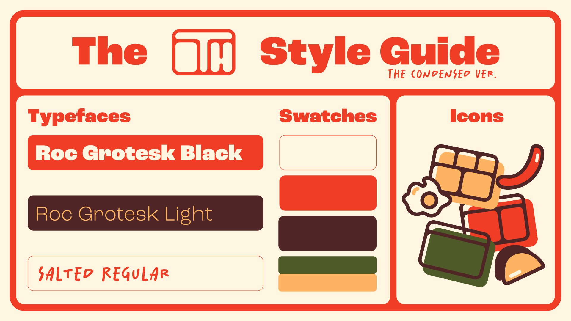
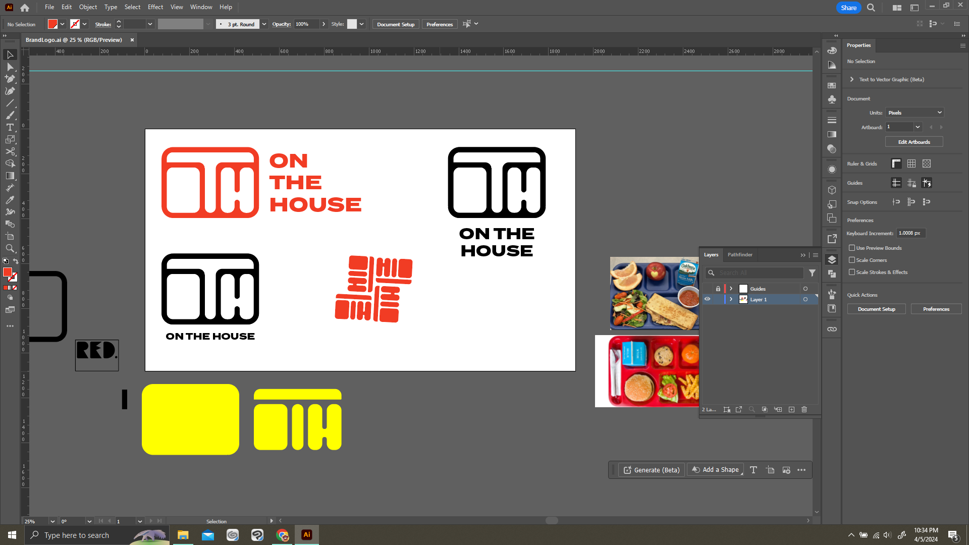
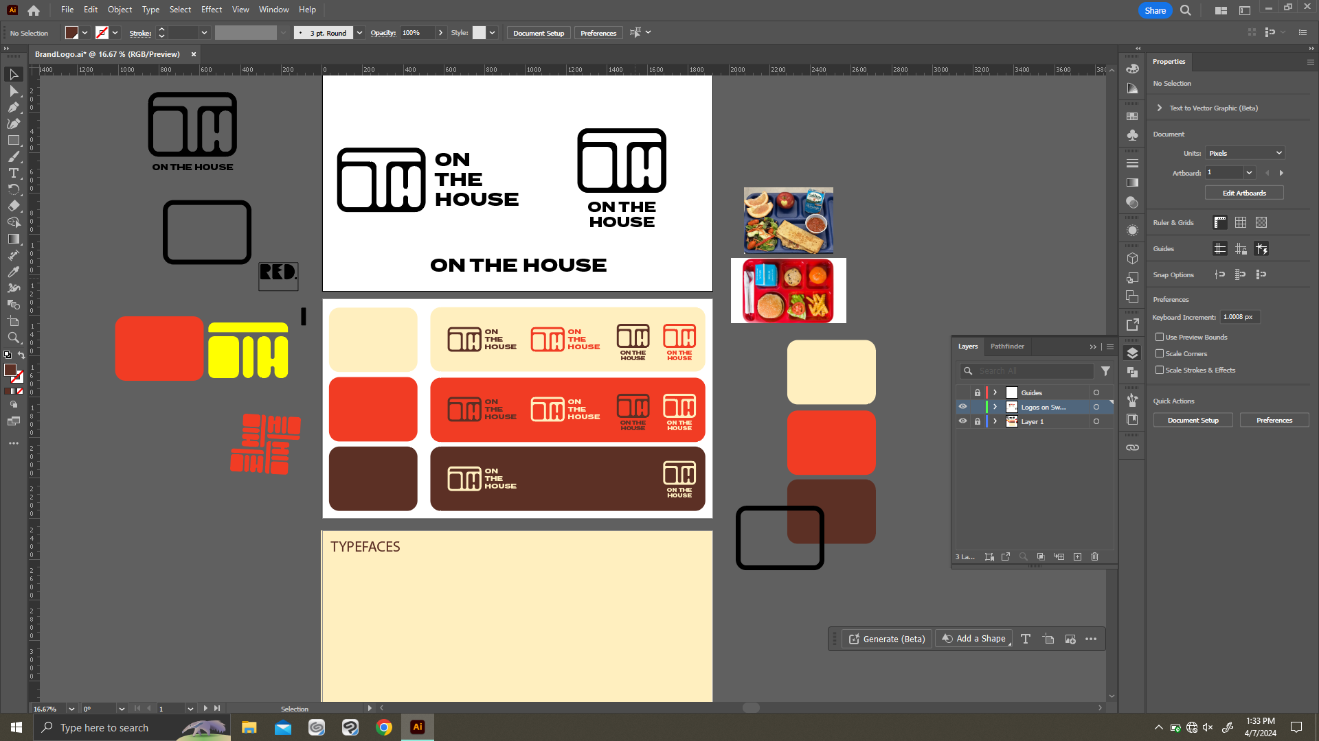
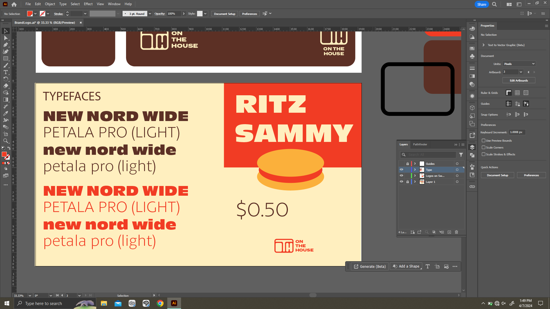
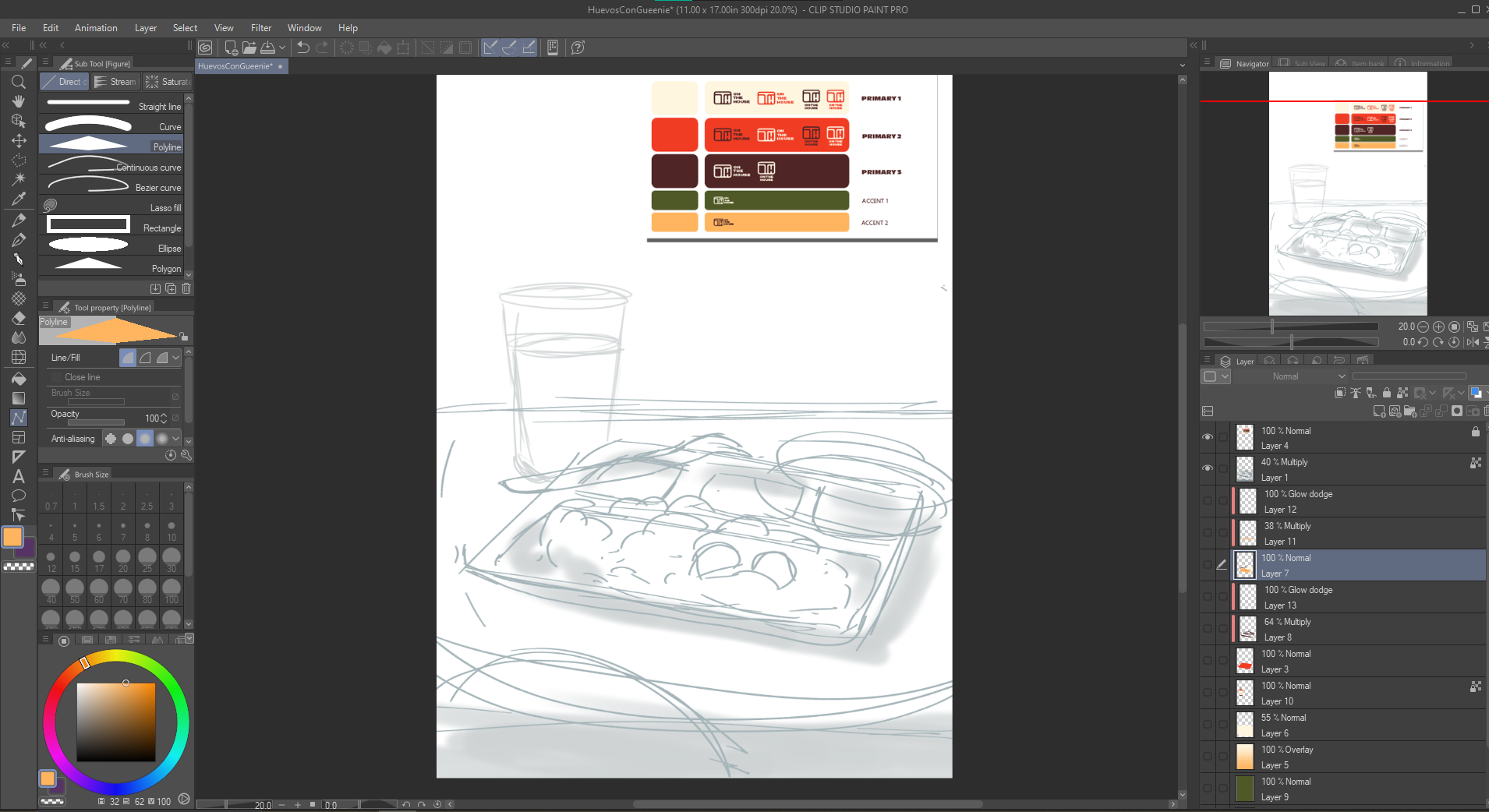
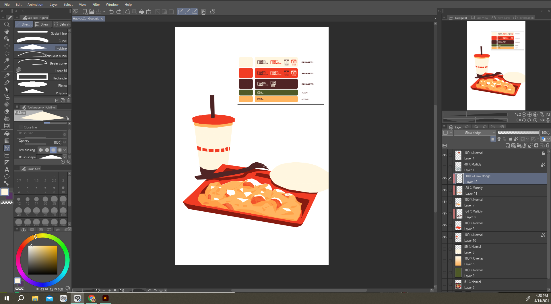
On the House is a brand that needed to strike a balance between emulating the inspirations of fast food and also the personal story of children scrapping by, raised by immigrant parents who did the same. Let's start with the typography. It needed to be bold, but still friendly and rounded. Roc Grotesk was chosen because it matches these qualities and contrasts well with Salted Regular. The intention was to create a dialogue between the two where the more uniform and professional type is interjected by the the more personal and crass lettering.
Our three primary colors are a warm eggshell, a vibrant orange-red reminiscent of salsa, and a deep, charred brown to compliment the two. The two accent colors, toasted nopal (cactus) green and an egg yolk yellow provide a pop of color to create more rhythm within the designs.
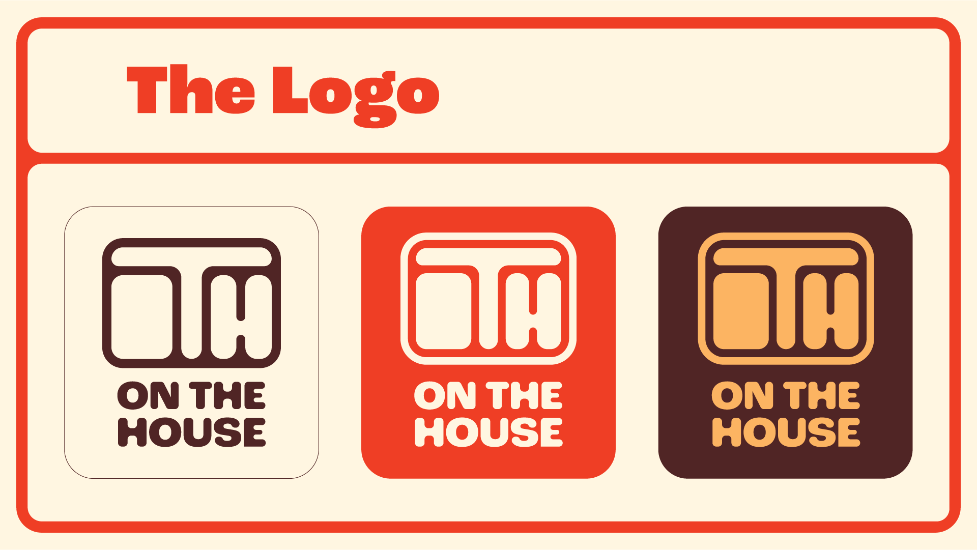
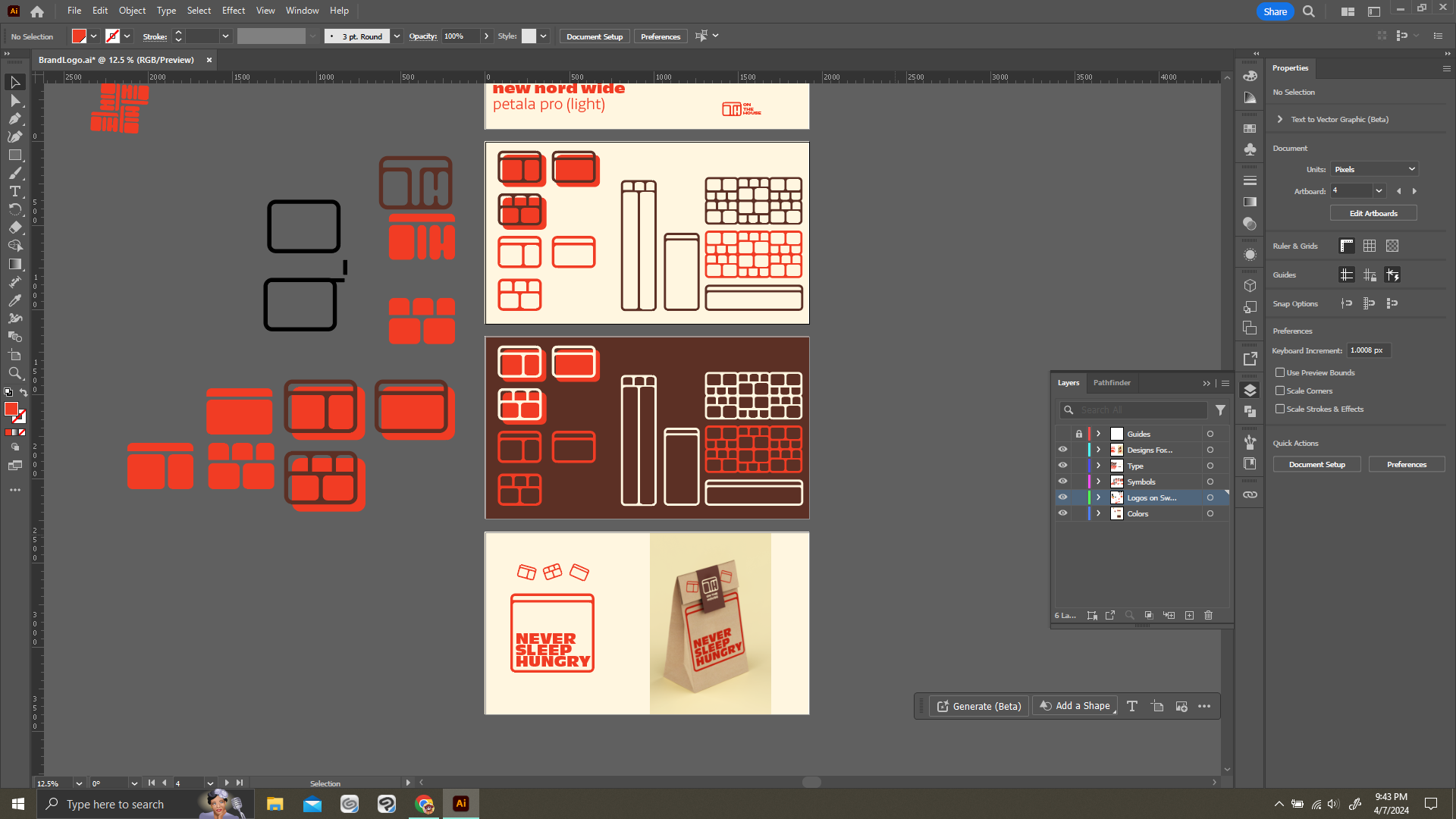
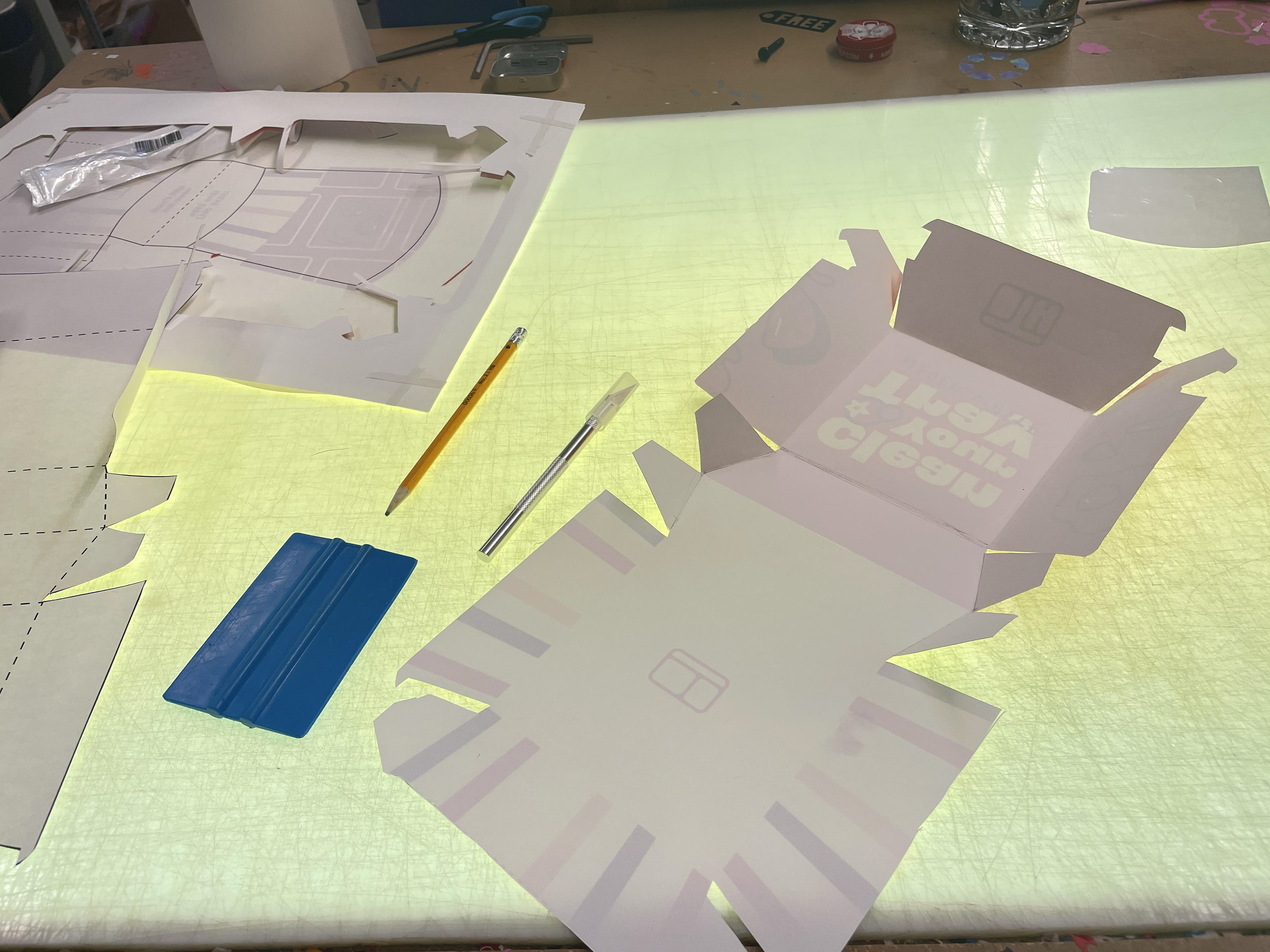
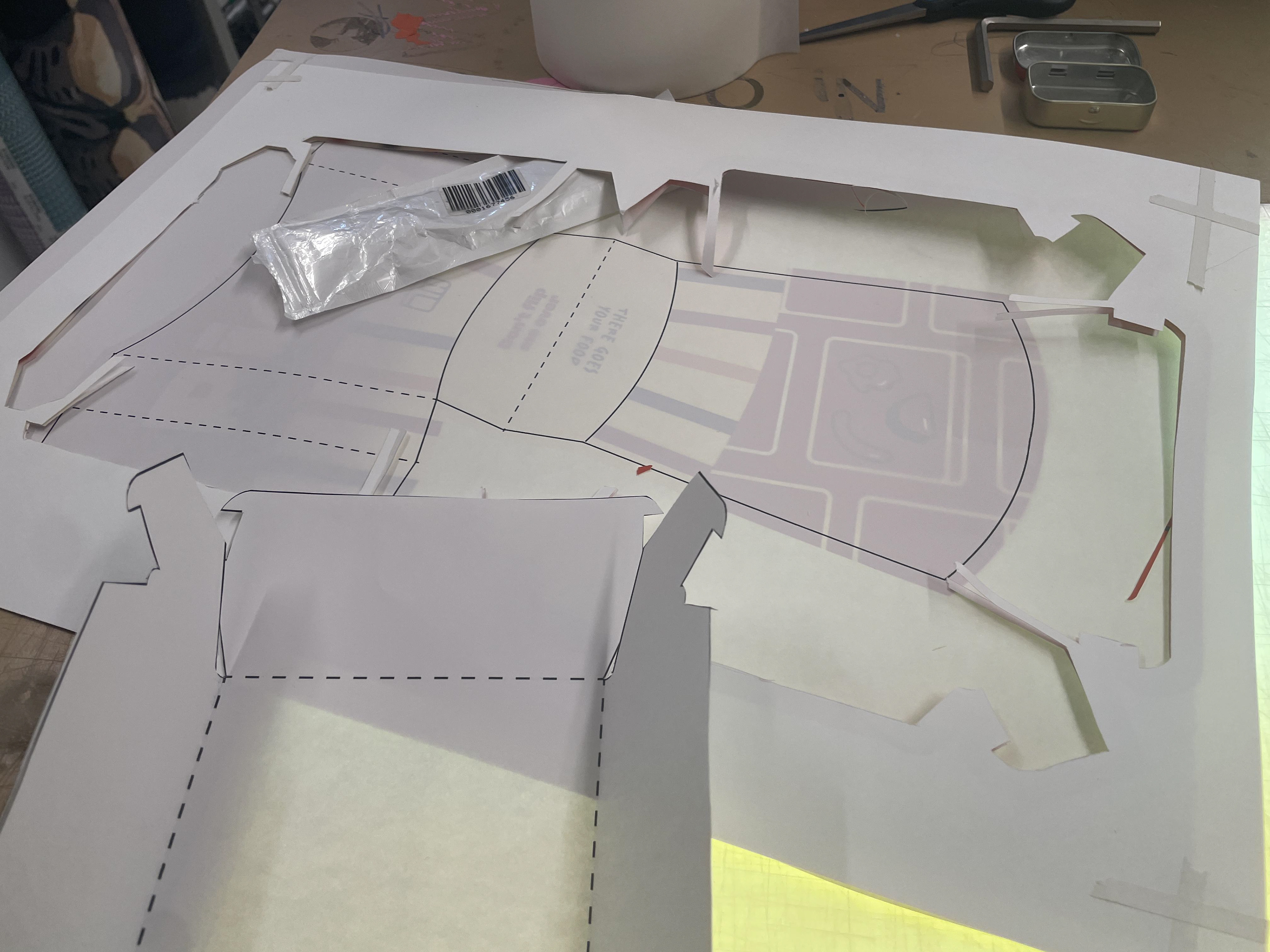
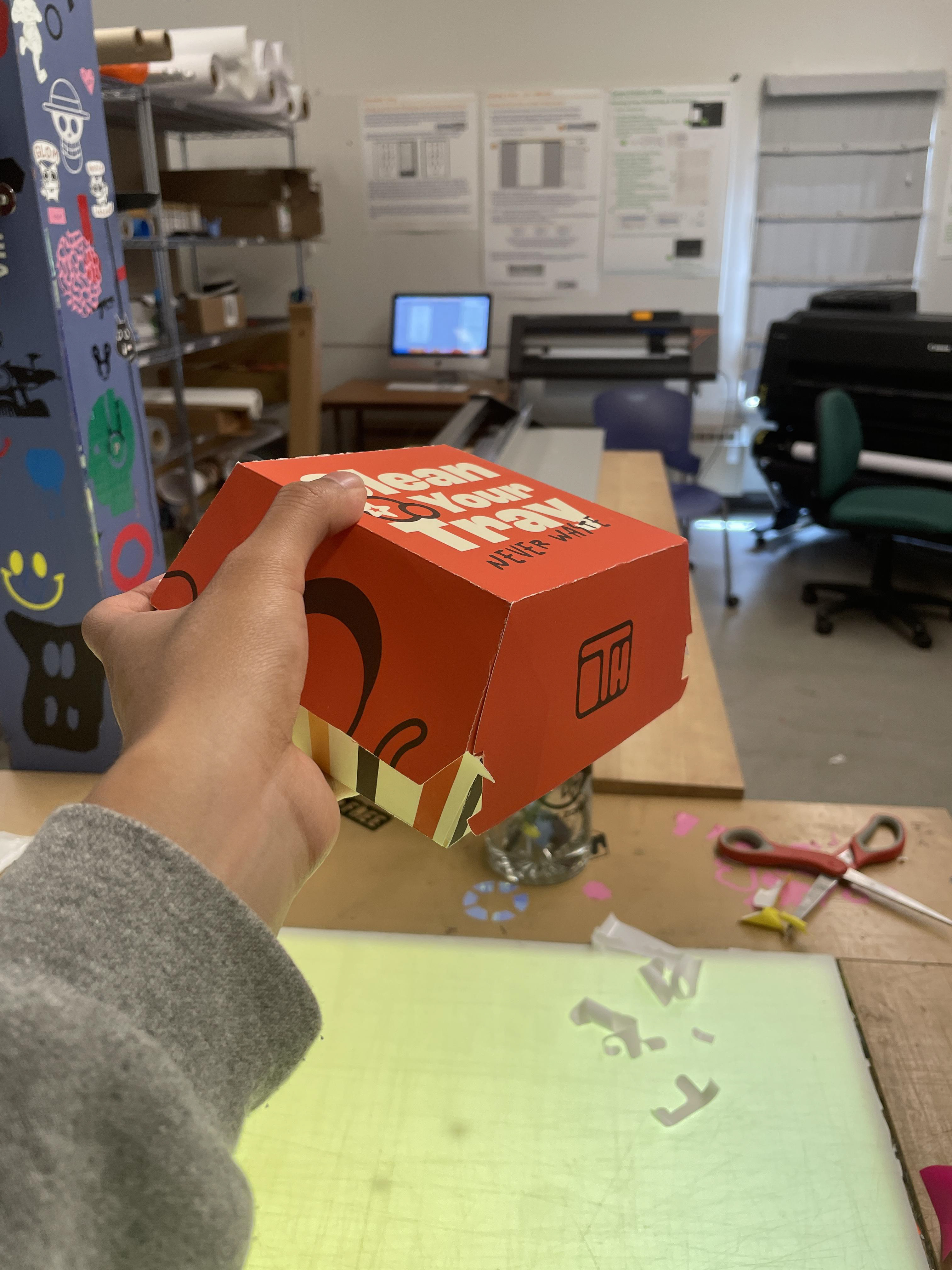
OTH also needed to incorporate school lunches into its lore. Free school lunches were always comforting because they were consistent and always there when you needed it. They were structured too. A segment for your main course, your sides, your snack and your utensils. The segmented food tray in turn became a symbol for the brand, so I incorporated into the logo and other icons to be used throughout my executions.
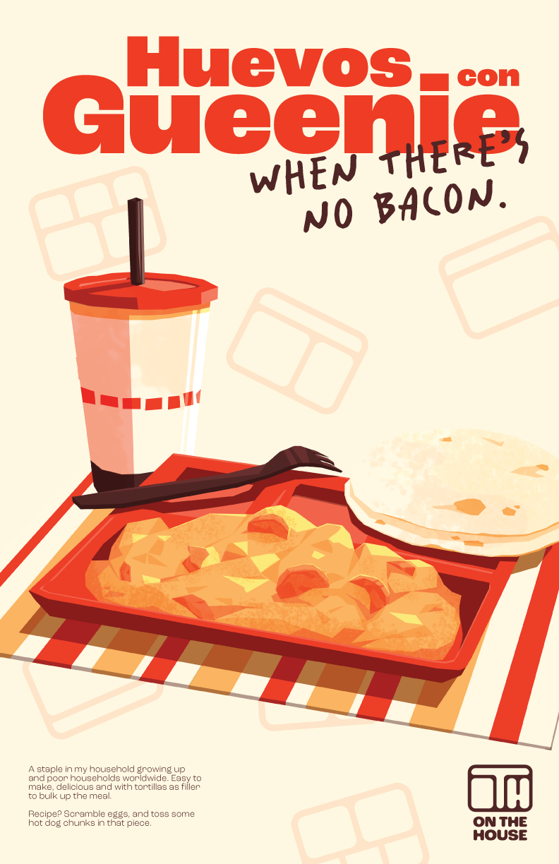
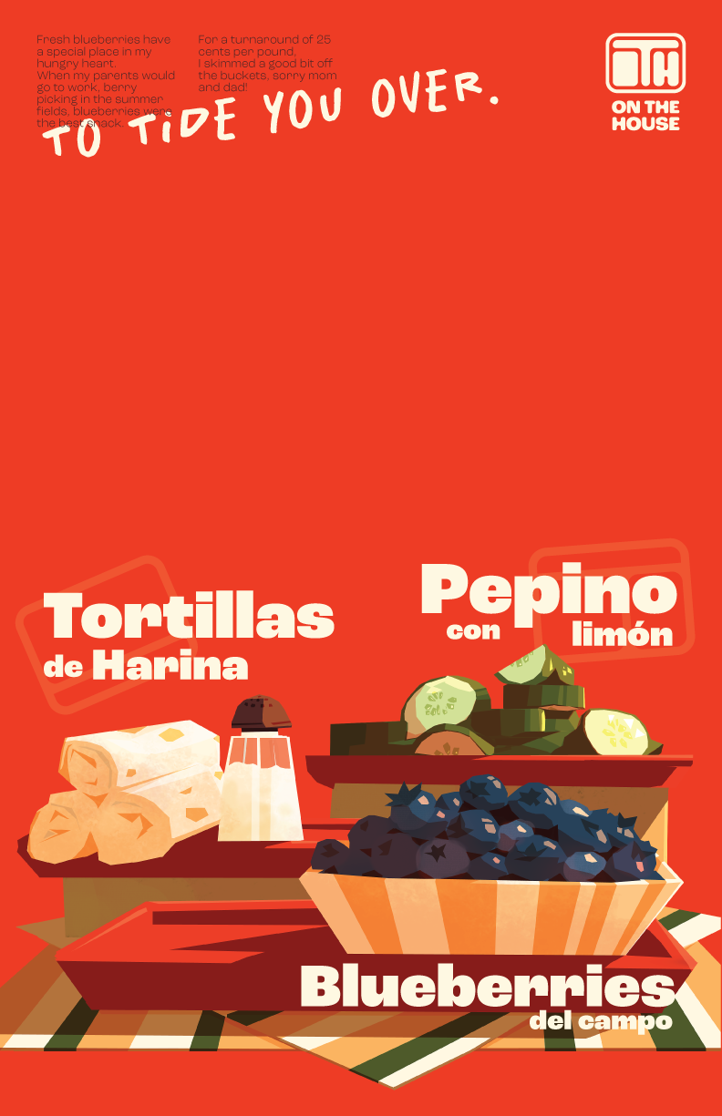
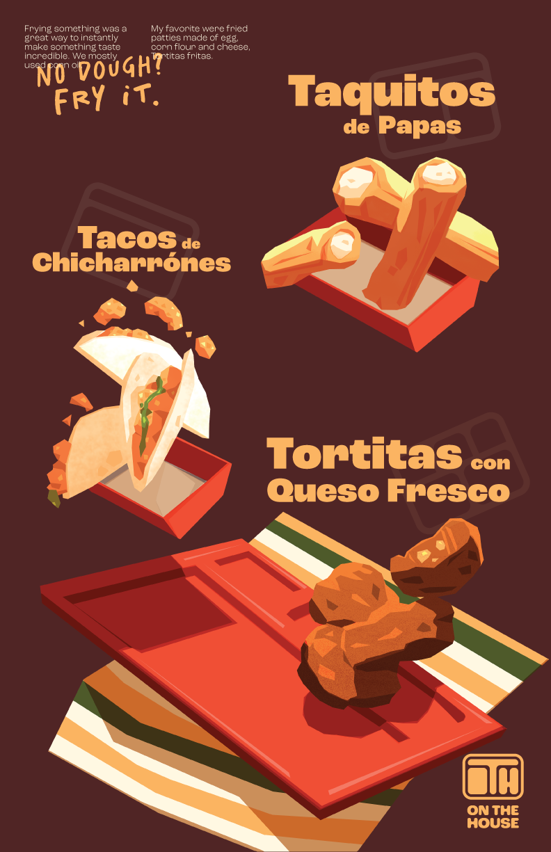
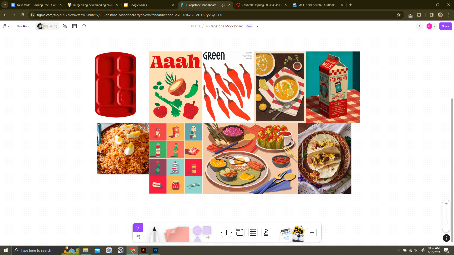
Each poster give more context on the meals pictured. I illustrated them in a fanciful and romanticized style because growing up, they felt like that and I wanted to place the audience in that same mindset. This series is not created to draw pity, but to look at the food I grew up with and get hungry. Prideful, in a sense. I still crave those meals now, shoutout to my momma.
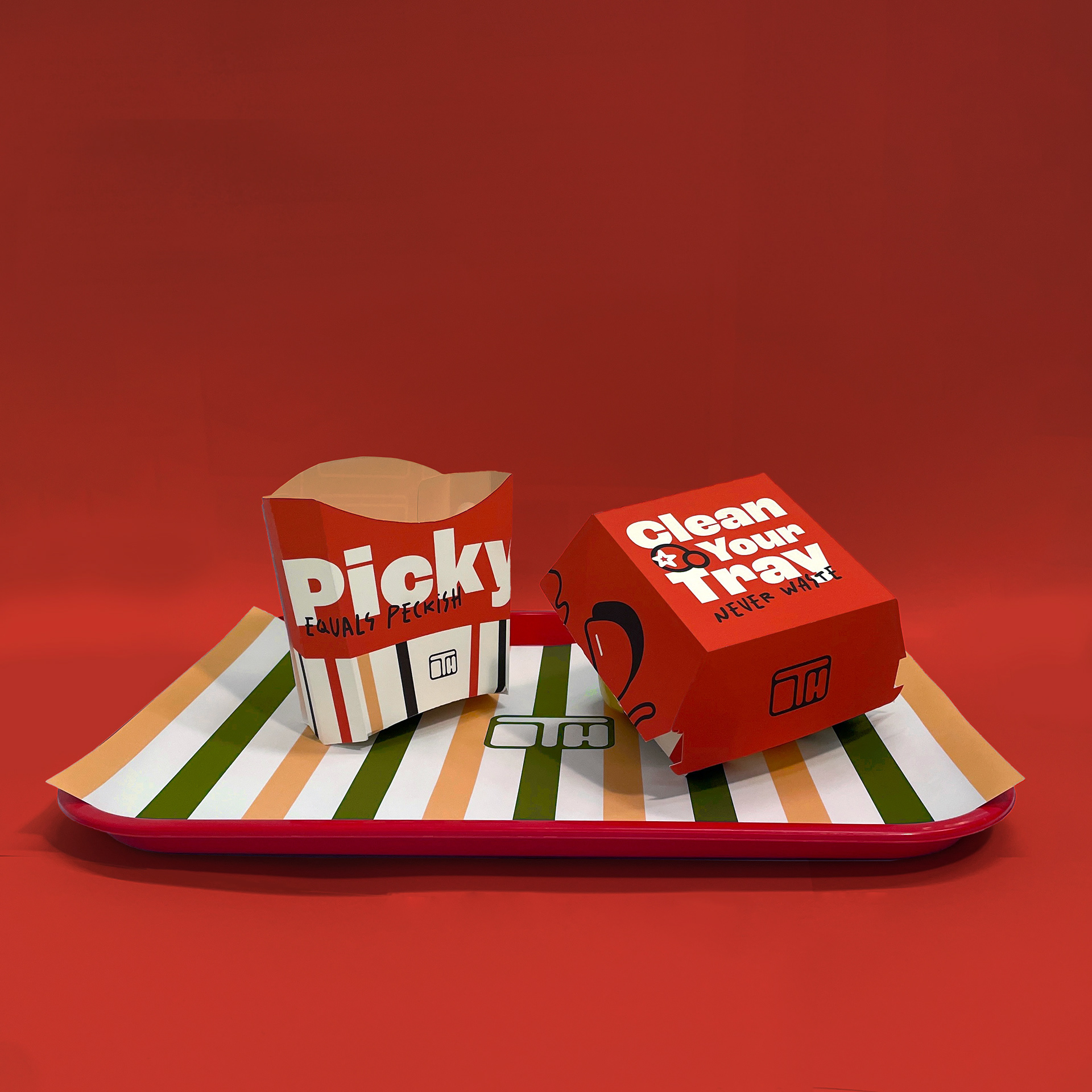
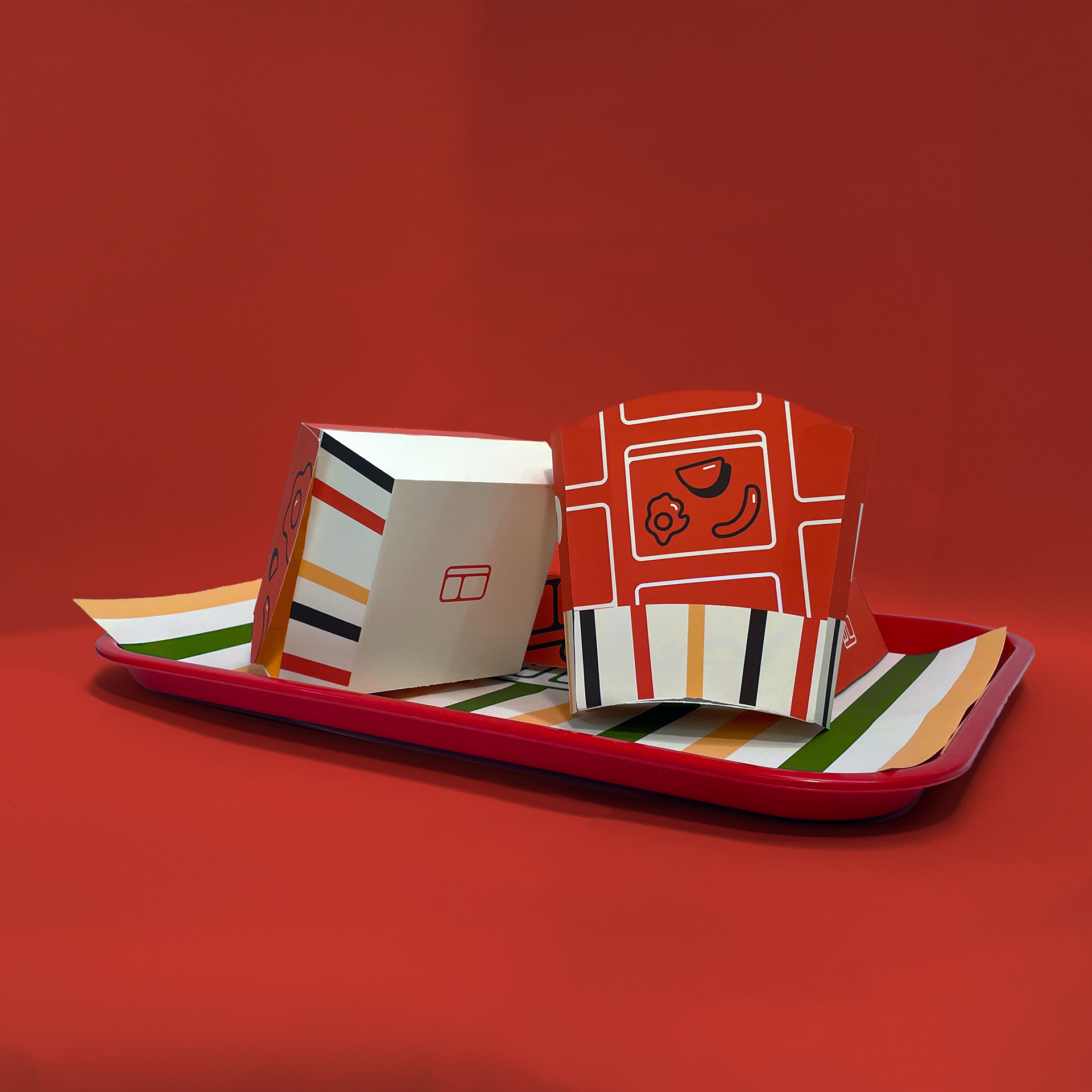
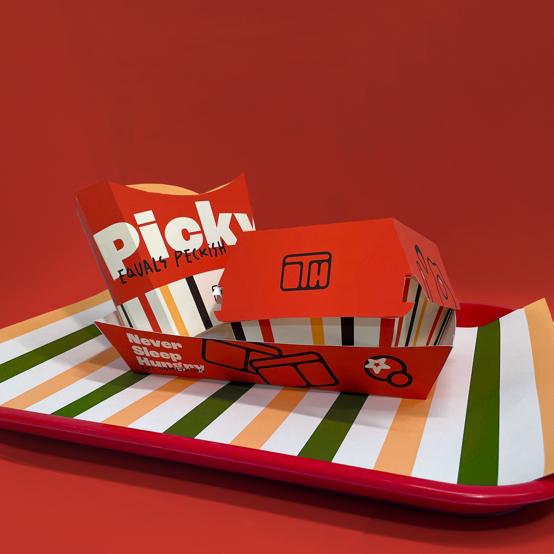
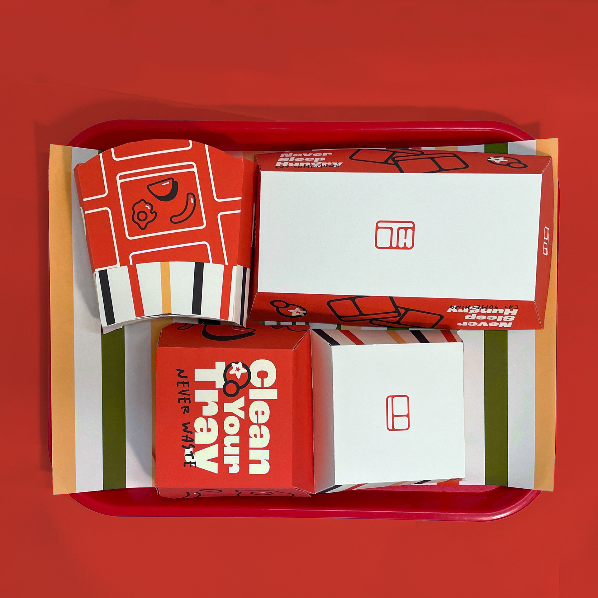
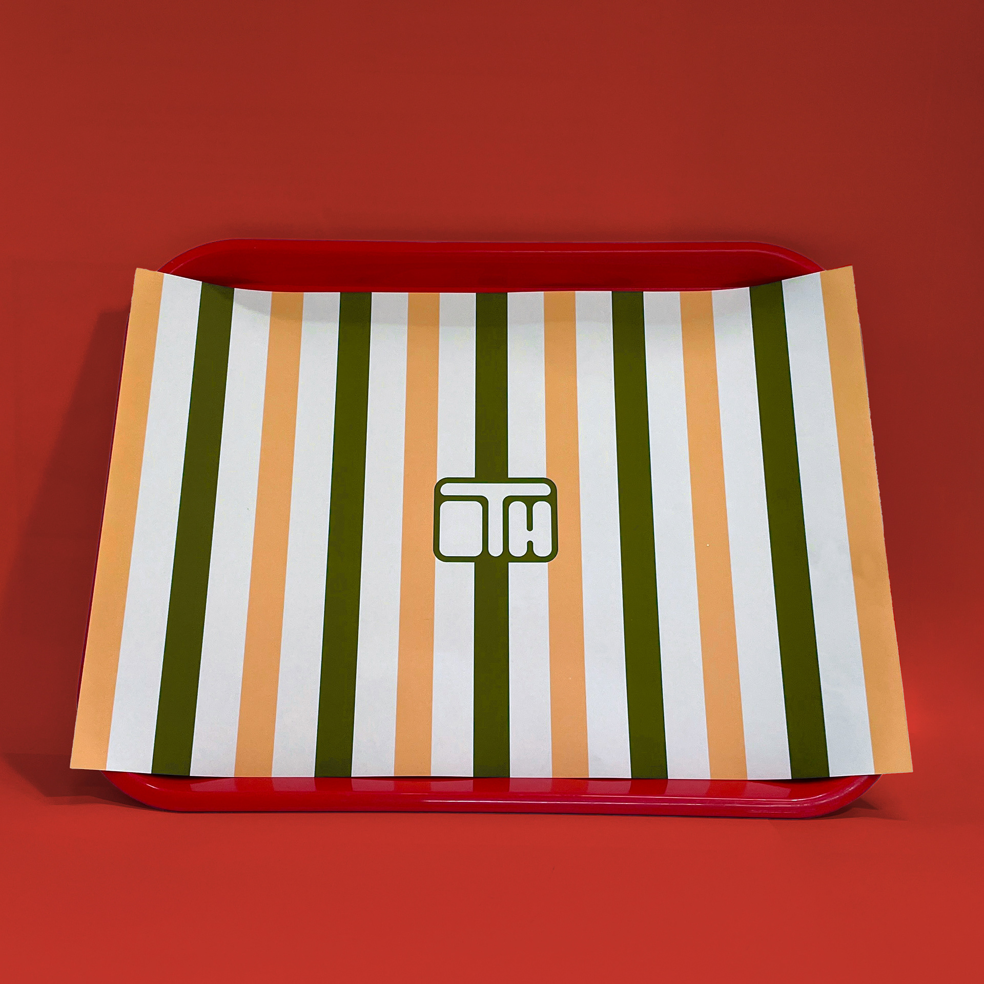
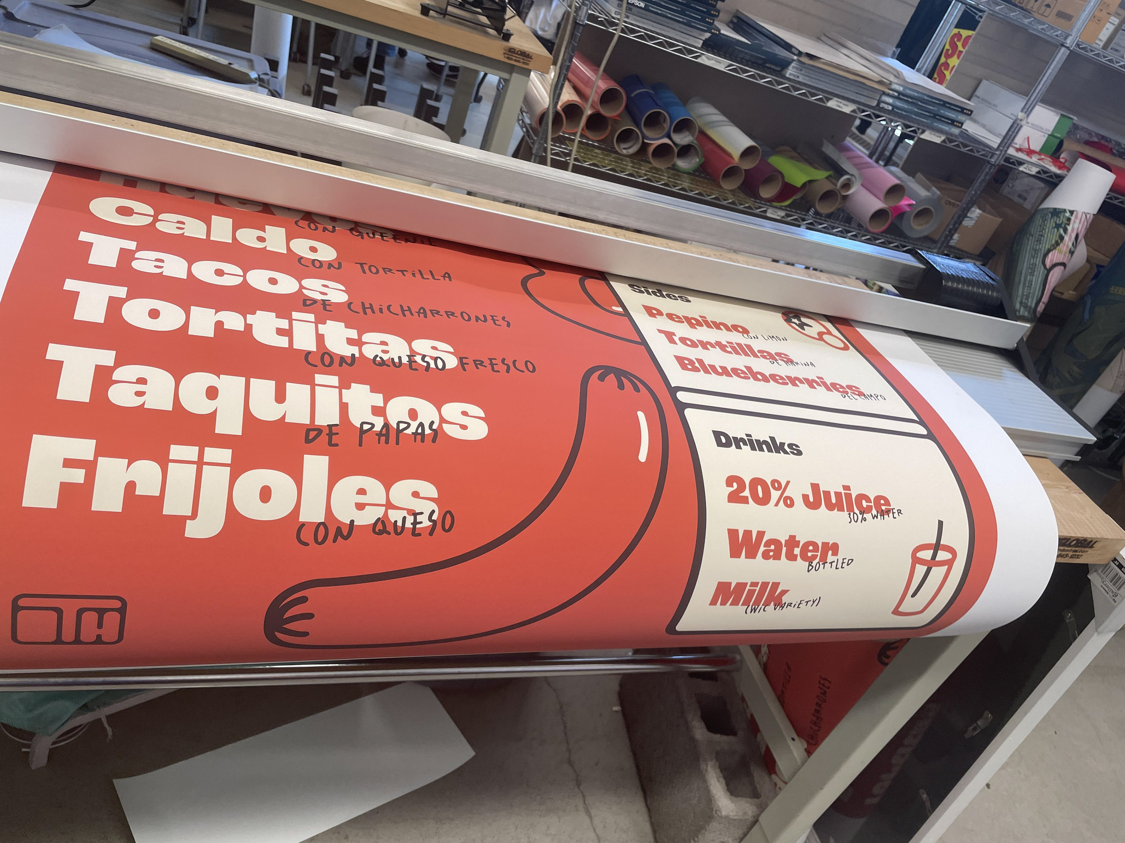
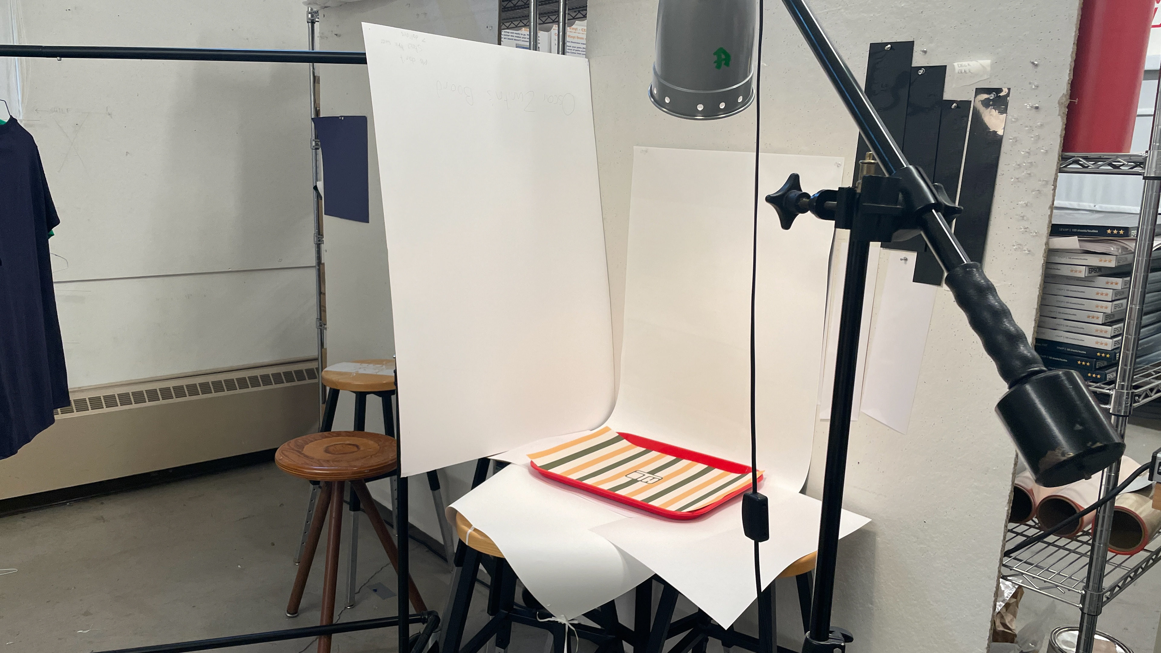
To envision how this brand would look like in the real world, I made real world mock-ups for packaging and other branded touchpoints. PSD mockups are great, but sometimes you just gotta have some fun with it. The rough-around-the-edges craftsmanship evoked the same scrappiness revolving around the brand, and I had a great time working physically with something after so much screen time.
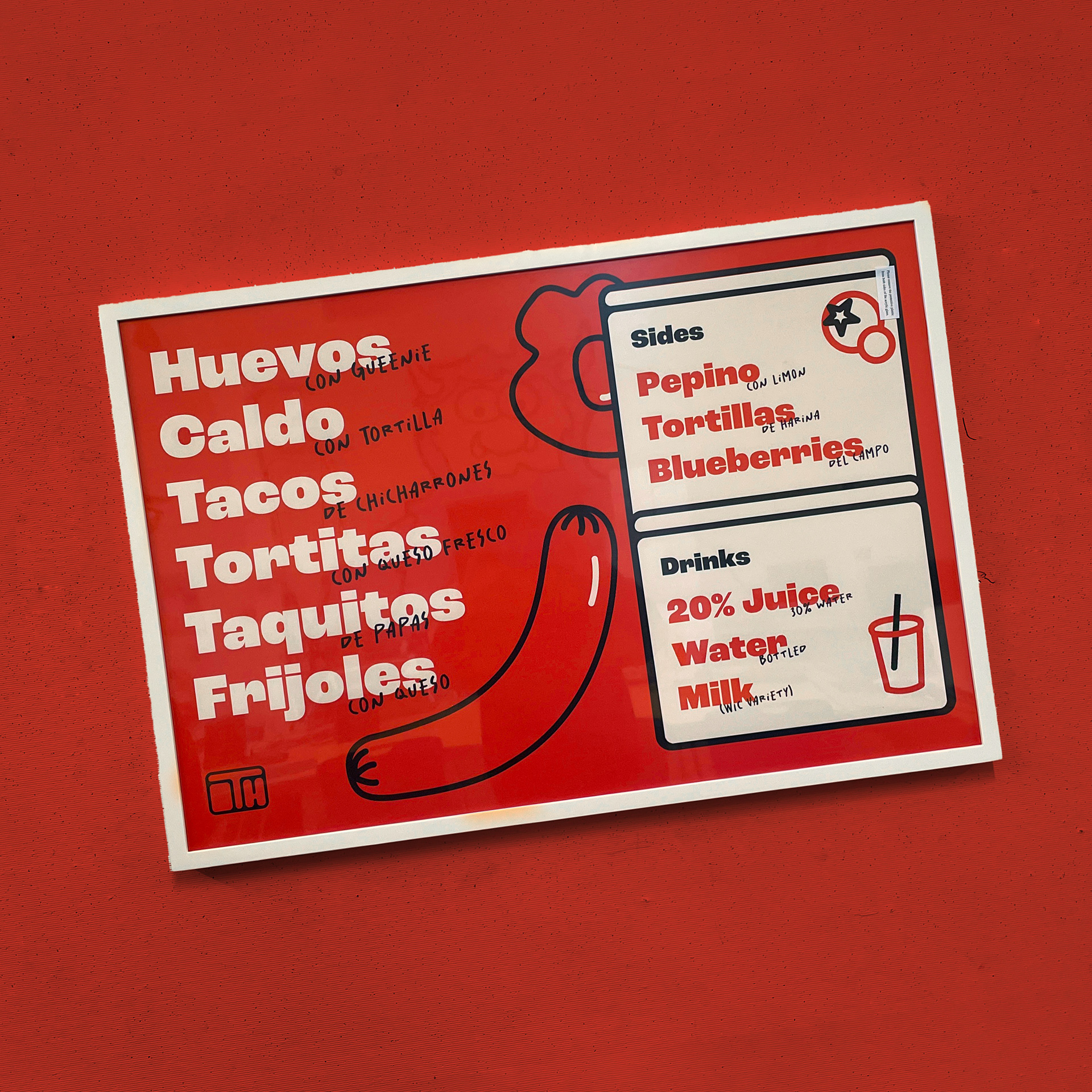
No food brand is complete without a menu, so I had to choose some of my favorites. This is a 24 inch by 36 inch poster framed and mounted.
THE PROCESS
Rough concepting, mood boards, preliminary typfaces and color schemes.
Sketching the layout and illustrations for my posters then testing different typefaces in Illustrator.
Backing away from the computer and putting my designs and ideas into physical objects, getting real scrappy along the way. If you've gone down this far, I really appreciate the interest in my work. There is always room for improvement, but I'm super proud of the project!